ubc Martin Ordonez Lab
Martin Ordonez Lab is a Research Centre belonging to the University of British Columbia, dedicated to exploring new possibilities in Power Converters and Renewable Energy Systems. His website is their main speaking platform, from which they communicate their achievements to other students and researchers from around the globe.
challenge and opportunity
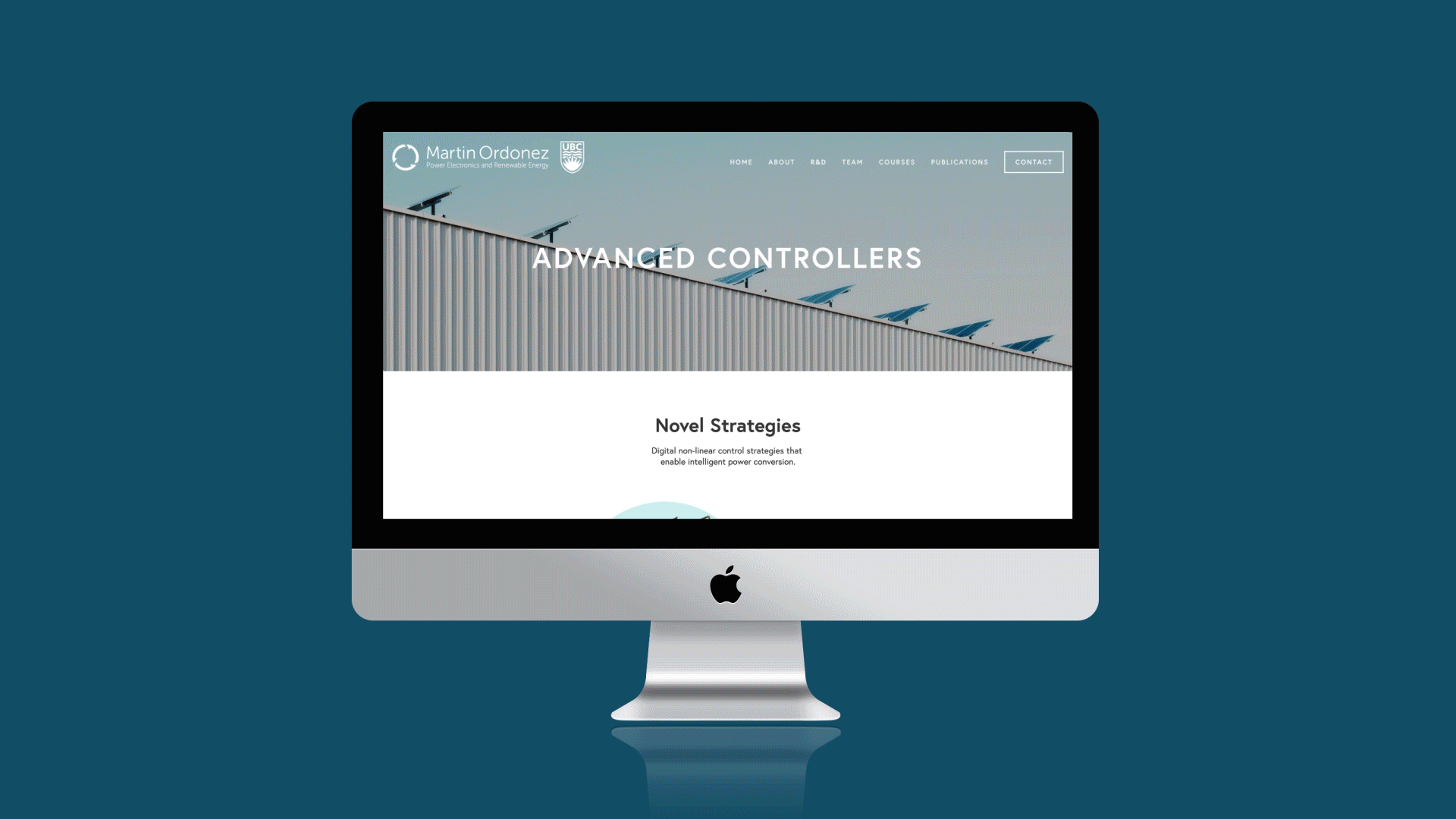
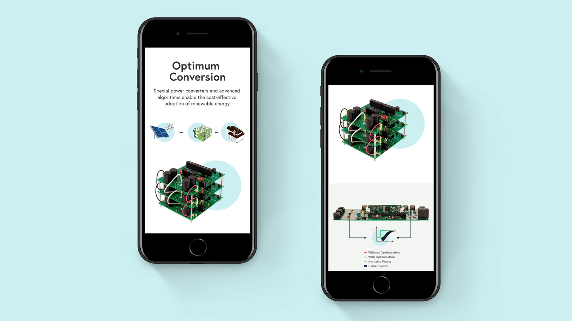
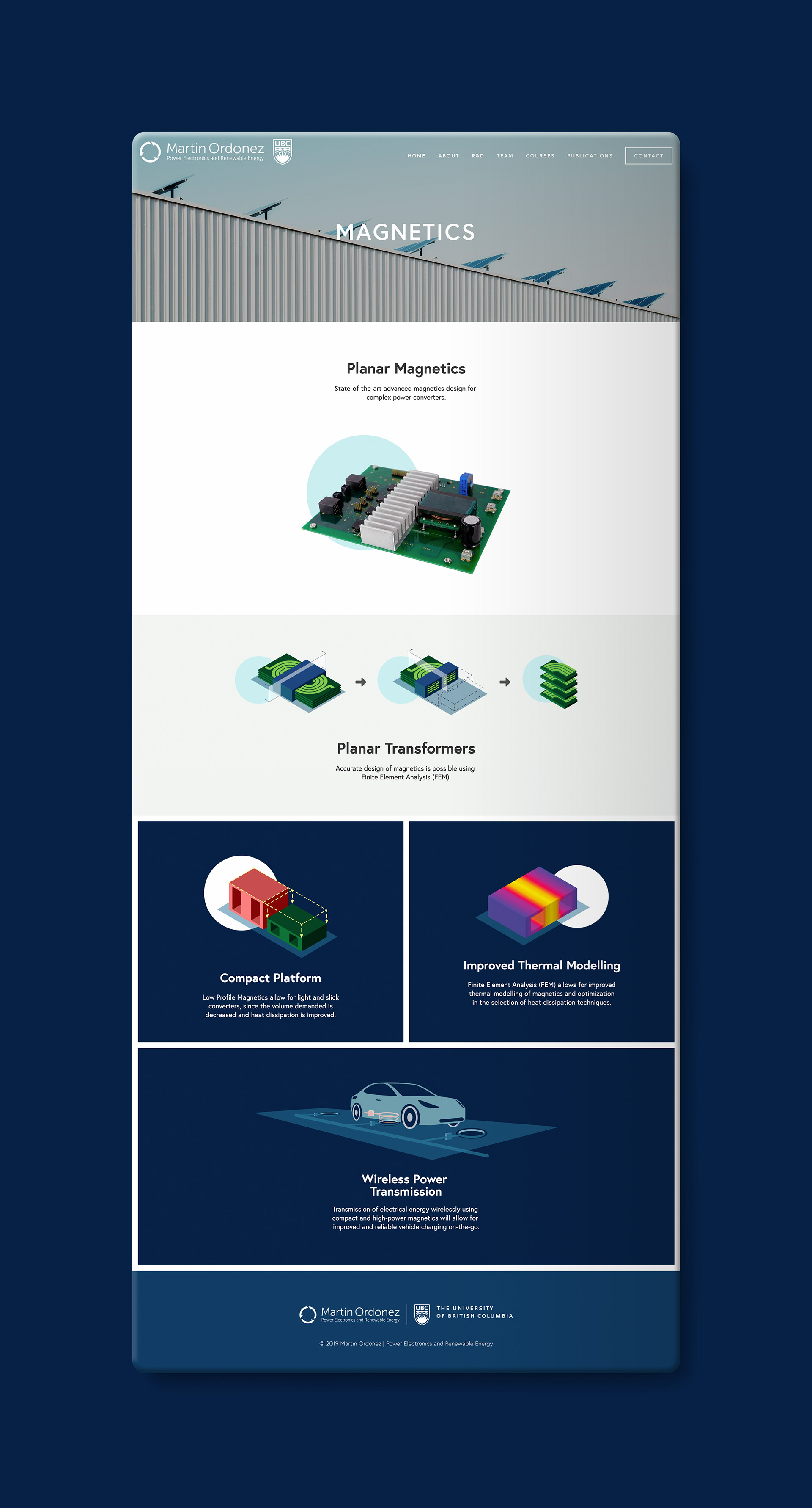
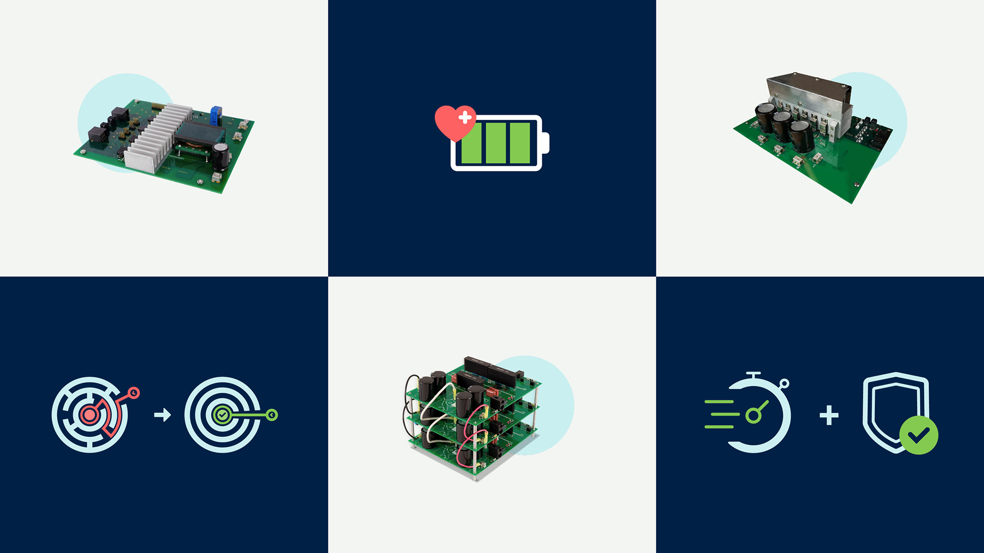
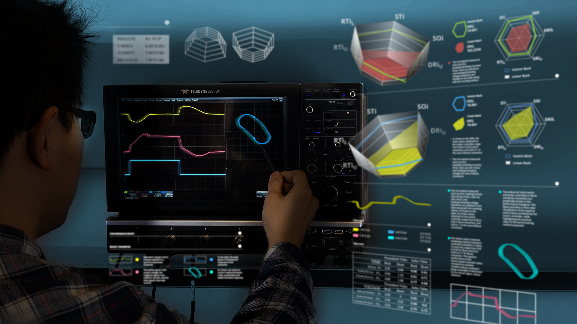
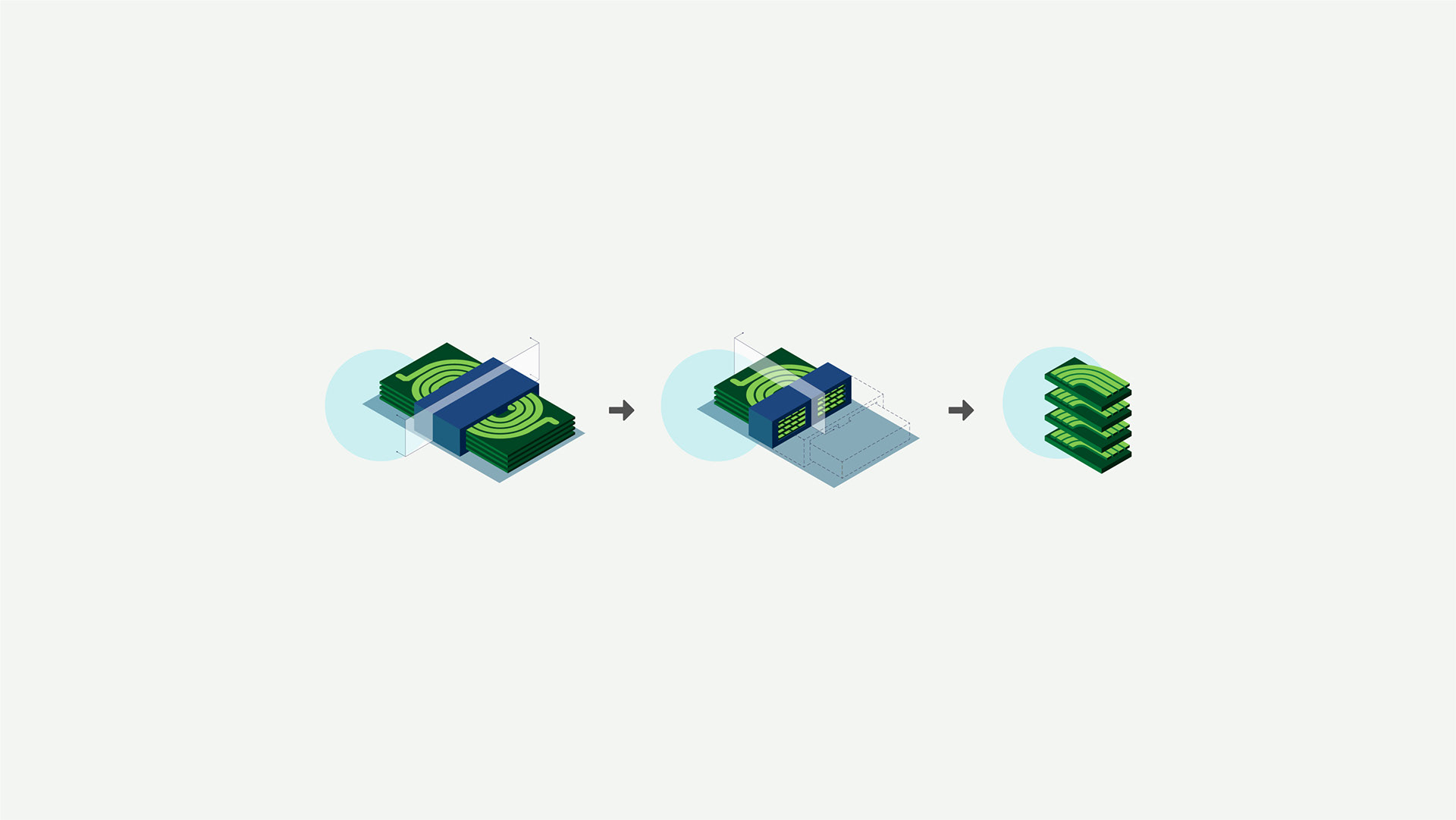
I was brought as a Graphic Designer to develop a new website section called “Research and Development”. The challenge was to create several landing pages that show the different research fields of the Lab. I used diagrams, graphics and photographs to synthesize complex concepts into understandable and appealing pieces of information.
the solution
Each landing page is divided into 3 separate sections:
• the first one presents the main topic with a picture of an electrical system or a study model
(on a white background)
• the second section shows experiments or facts that support the main section (on a light grey background)
• the third one highlights the improvements and discoveries of the new model (on a dark blue background)
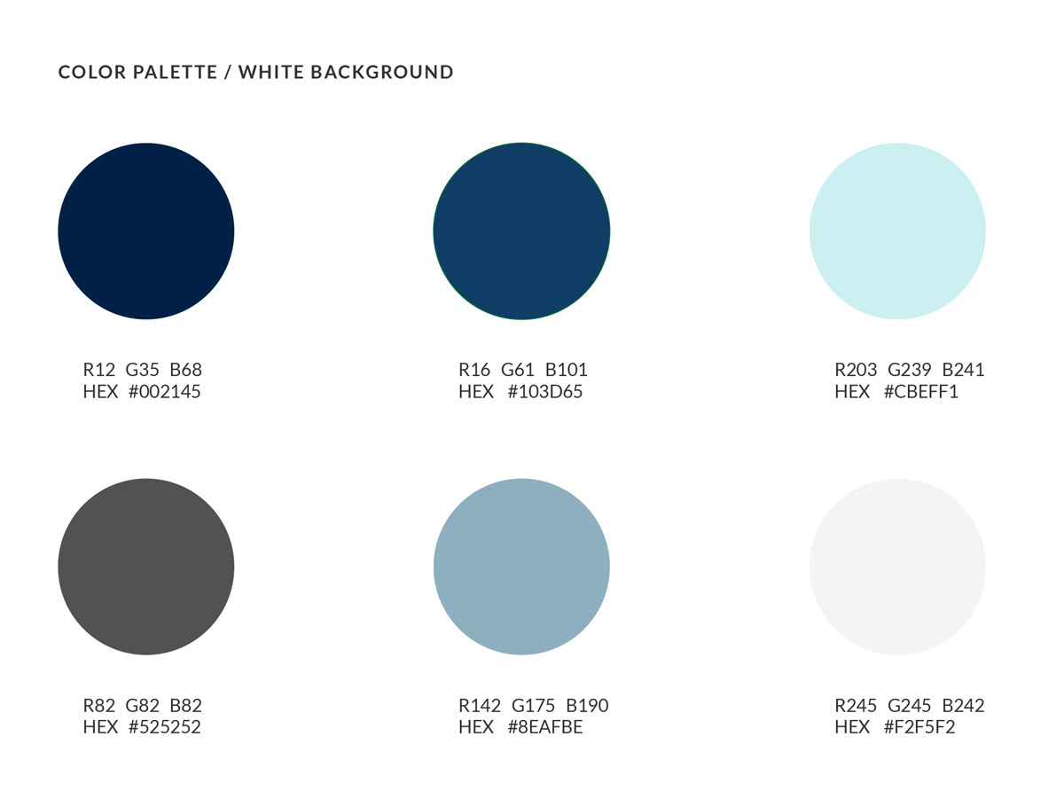
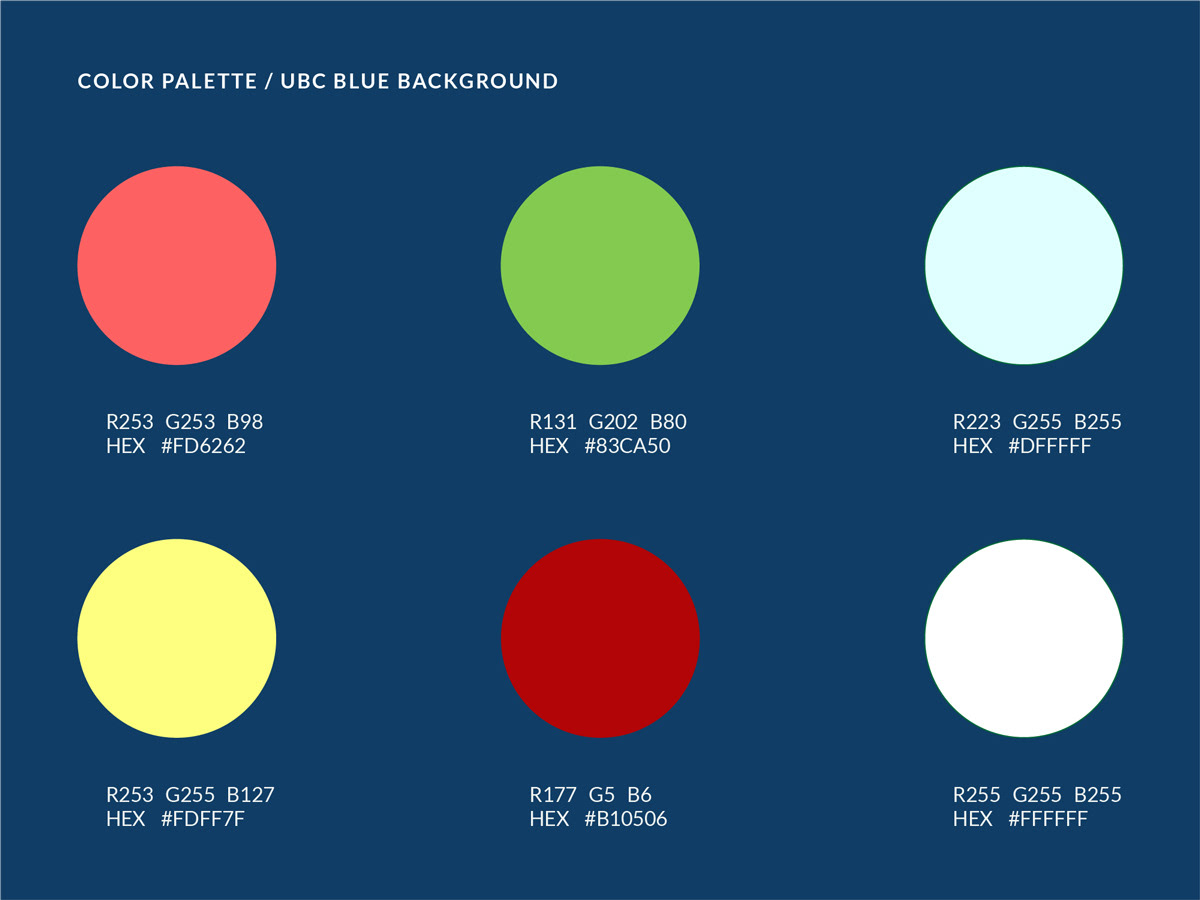
Based on the UBC branding colours, I employed 2 different colour palettes, depending on the background colour that framed the illustrations: light grey/white or dark blue tone. All selected colours communicate intuitive ideas (right-wrong, efficiency, power, movement, etc) and all illustrations are simplified to the maximum without losing expressiveness.
linkedin banner
Role: Creative Director
Concept: Showcase the Lab space with the members working on different projects. The idea is to emphasize teamwork and collaboration values.
Execution: Record different actions framed into the same panoramic picture, expressing dynamism and movement inside an illuminated working space. The used colour palette is blue, white and grey tones.
Title: UBC Martin Ordonez Lab
Year: 2019
Tags: Web, photography, illustrations, colour palette
Photography for LinkedIn project: Bili Panic
Year: 2019
Tags: Web, photography, illustrations, colour palette
Photography for LinkedIn project: Bili Panic