Tomomi & Jorge Wedding
A wedding is for a couple the most important event of their life together. Both bride and groom spend a year or more preparing, dreaming, planning, rehearsing,... to reunite one day with their close friends and family and spend a few hours together celebrating this magical moment. Branding the event is a way to ensure the whole day comes together in total harmony, making it even more memorable. Why don't I use my graphic design skills to create an honest and sincere experience and be able to express our emotions and our personalities through Branding?
challenge and opportunity
Apart from having a large list of items to be designed (invitation card, logo, website, etc) another unexpected challenge occurred: the Covid-19 pandemic. Having a wedding during this time was daunting - especially an international event in different countries. But despite all difficulties, like any good design problem to solve, there was an opportunity on the other side. Time to work on a thoughtful design increased, and we, as a couple, could make wise decisions about planning the event without high pressure. On the other hand, we enjoyed working on each element and imagining our wedding through them, expanding the feeling of the wedding day during all the prep time.
the solution
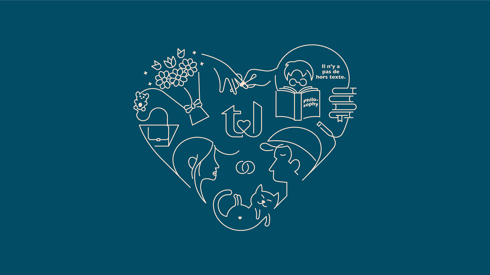
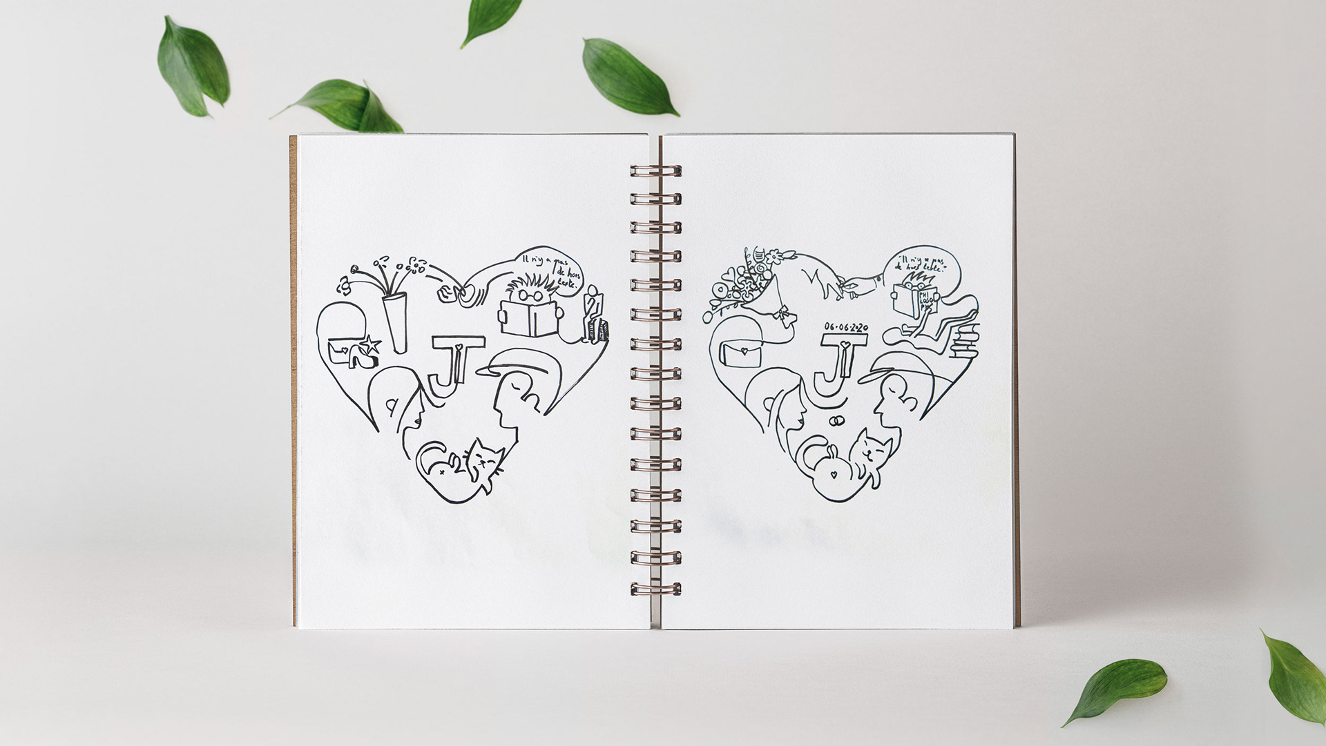
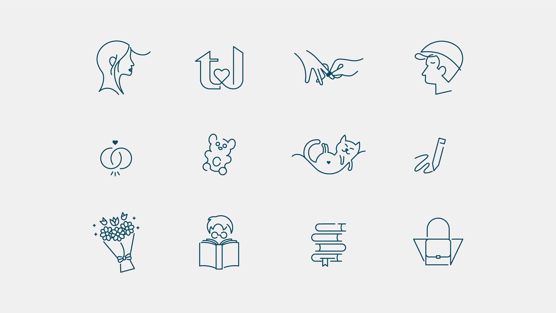
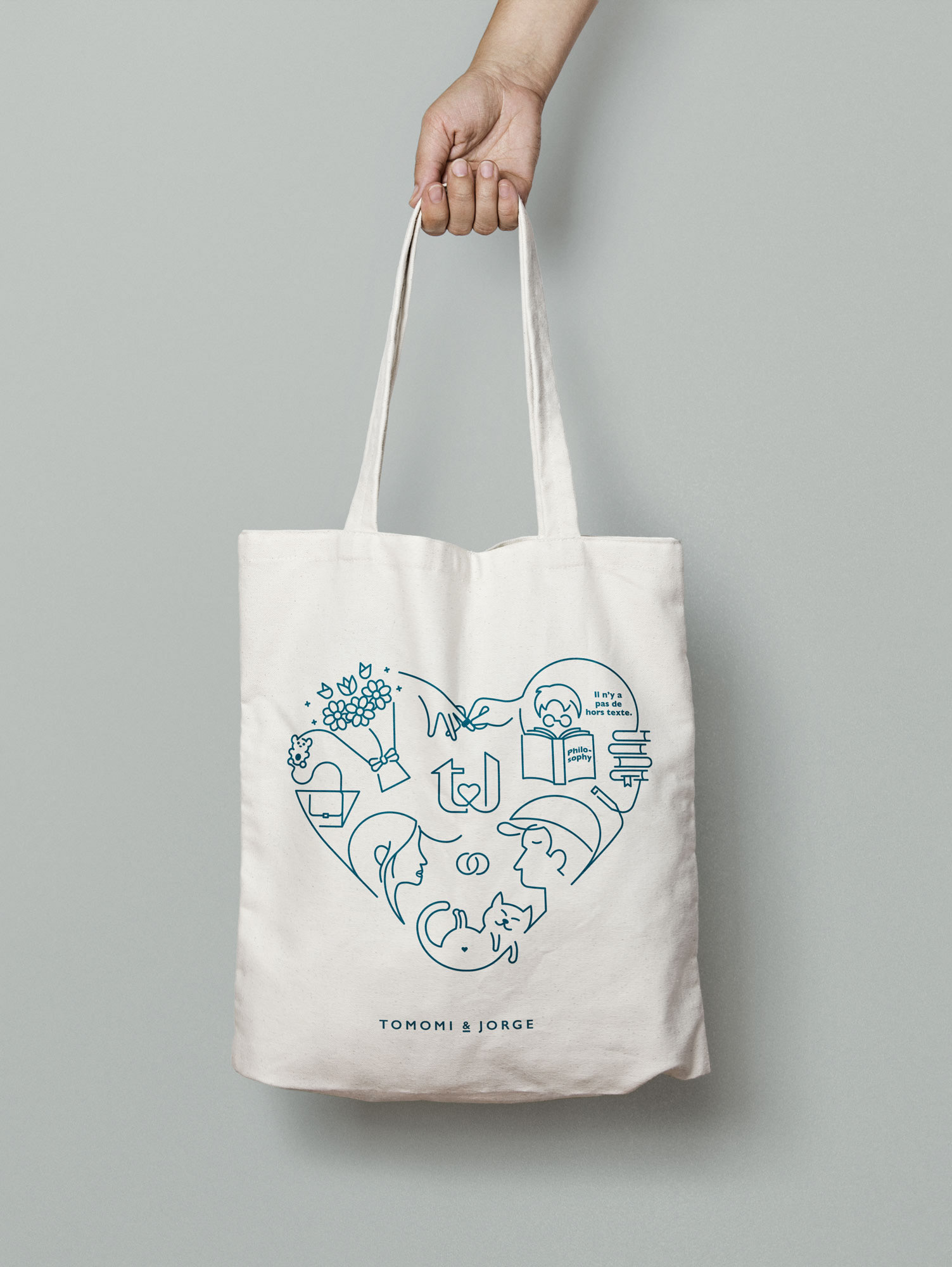
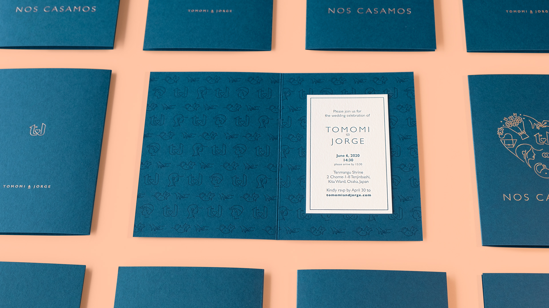
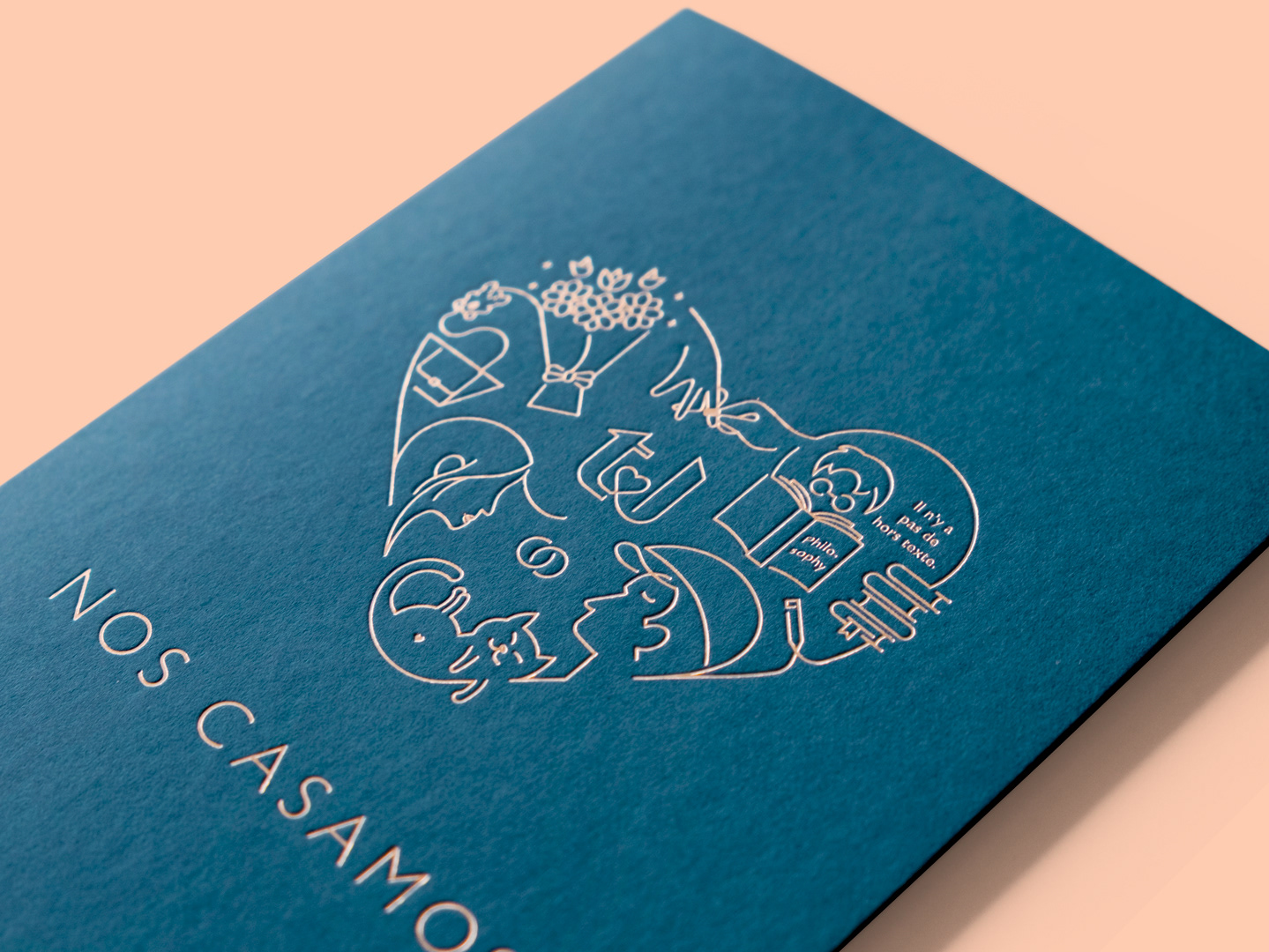
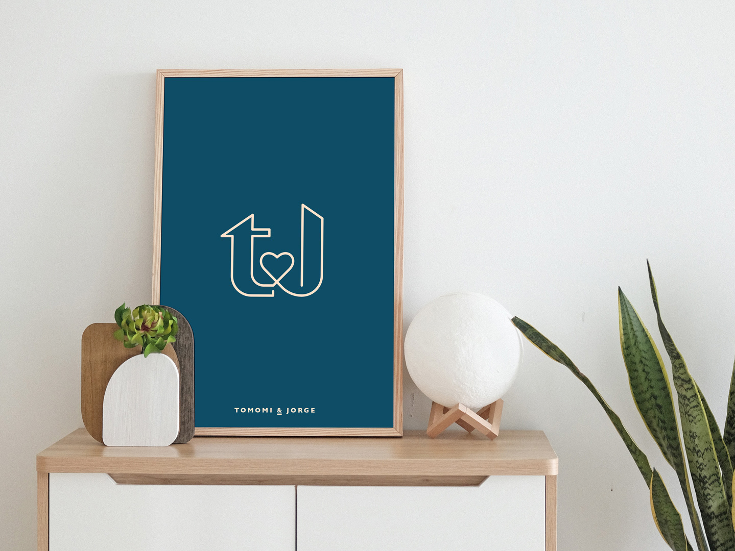
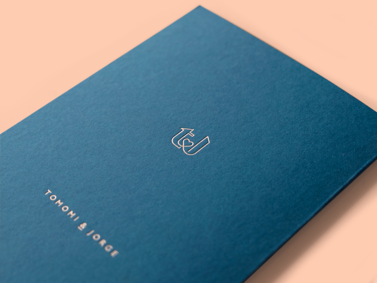
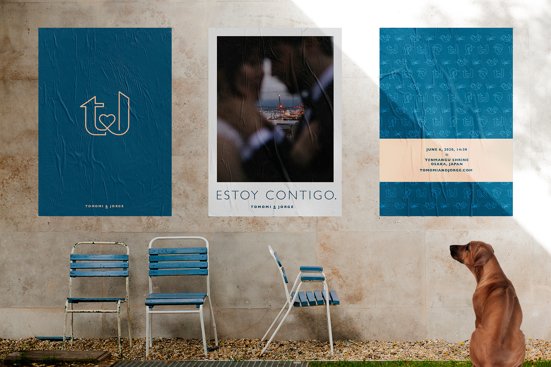
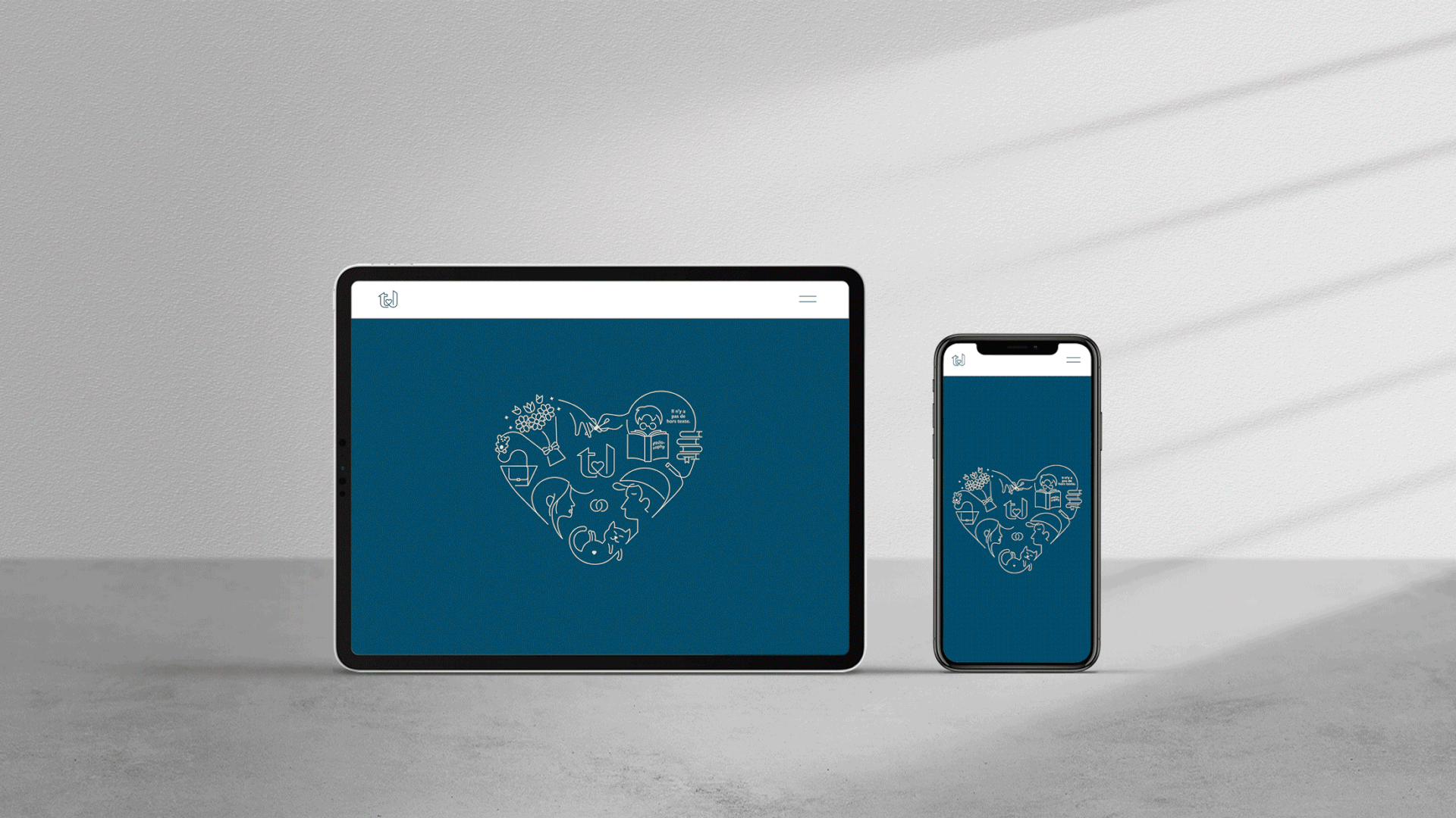
We thought about a key strategic concept that integrates all the branding and conveys our personality and character: warm and optimistic, a little childlike but honest, thoughtful and austere. The solution was to design an illustration of a heart containing ourselves, with our hobbies and passions represented by icons, and our monogram logo "t&j" in the centre of the drawing. All objects are connected by a continuous line that traces their silhouettes while leaving the icons unfinished, symbolizing our common life (one uninterrupted line) and the open future ahead (unclosed drawings).
Due to their special characteristics and rules, the kamon was designed separately, but it can also be integrated as an icon with the other designed elements.
Role: Creative Director & Graphic Designer
Title: Tomomi & Jorge Wedding
Year: 2020-2021
Tags: Logo design, web, photography, illustrations, colour palette
Pre-wedding day photography by: Page & Holmes
Title: Tomomi & Jorge Wedding
Year: 2020-2021
Tags: Logo design, web, photography, illustrations, colour palette
Pre-wedding day photography by: Page & Holmes


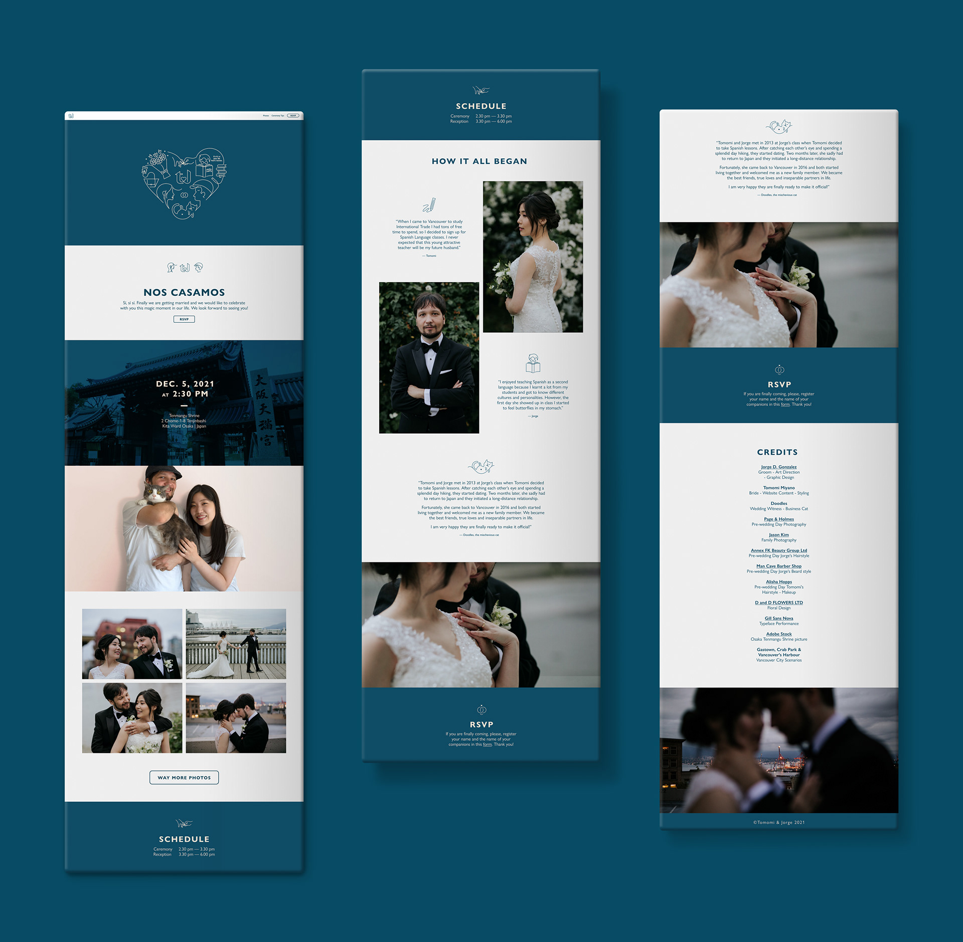
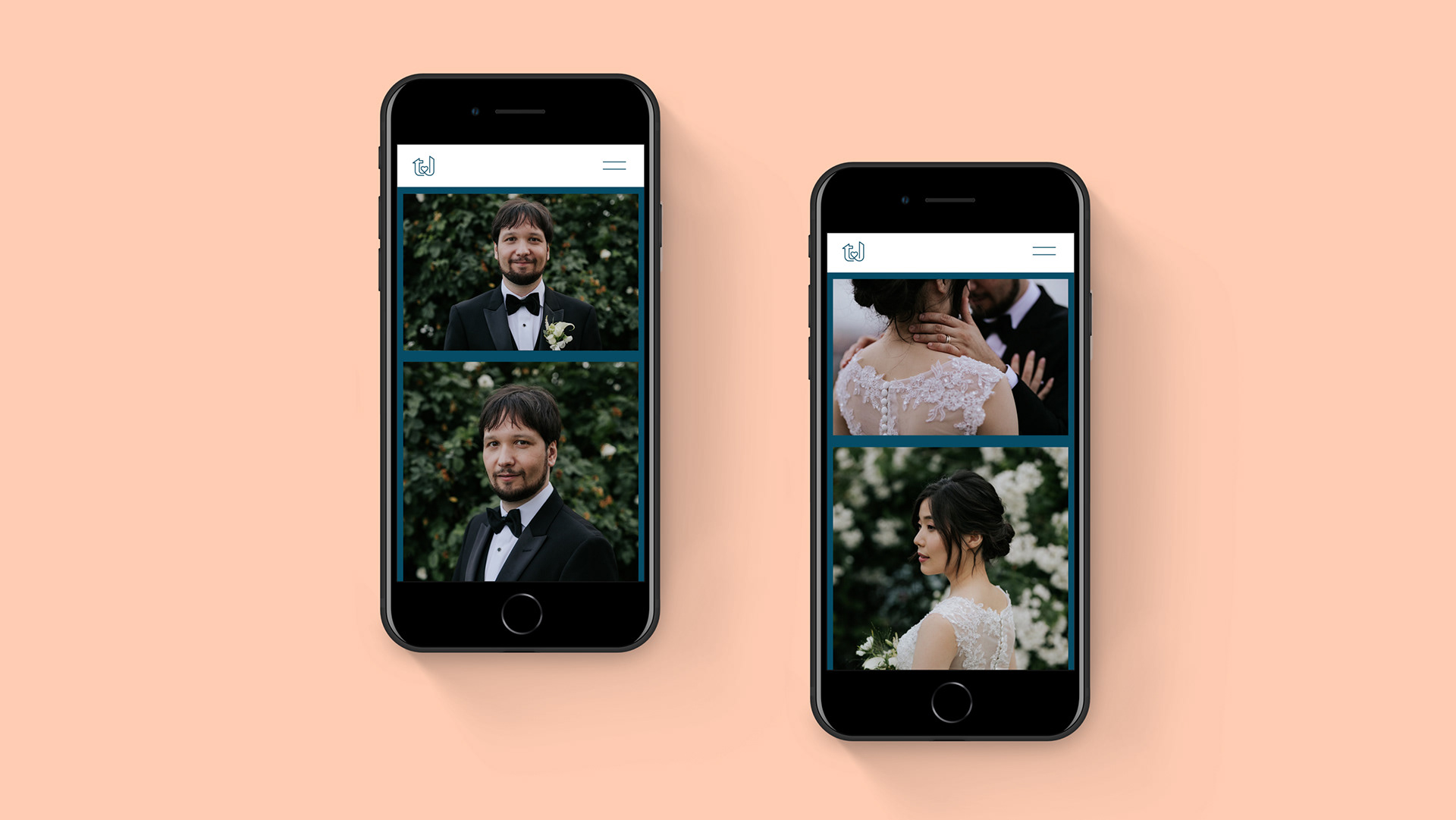
Tomomi & jorge website
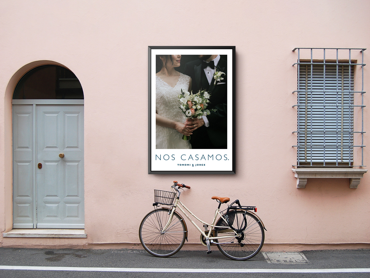
Concept: Create a platform to formally invite guests to the wedding. The idea is to promote the event and show the enthusiasm of the couple to celebrate with family and friends together this magic moment in their life.
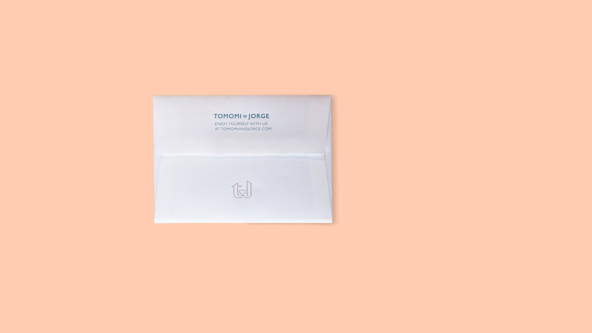
Execution: Customized Squarespace theme with injected code (CSS and jQuery) to achieve an elegant look, display the information fluently and collect the guests' information. The attention to detail, in combination with the great use of illustrations and pictures, brands the event and transmits a cohesive idea and a personal character. The colour palette is dominated by the use of dark teal (in between blue and green tones) to communicate tranquillity and calm (blue) and also elicit feelings of balance and peace (green). To create contrast, we selected a light cream pinky colour, close to skin tones, which gives a human note and represents the groom and the bride's warm feelings.
Year: 2021
Role: Digital Designer and Developer
Tags: Web, photography, illustration, logo, form, website developer
Link: tomomiandjorge.com
Role: Digital Designer and Developer
Tags: Web, photography, illustration, logo, form, website developer
Link: tomomiandjorge.com
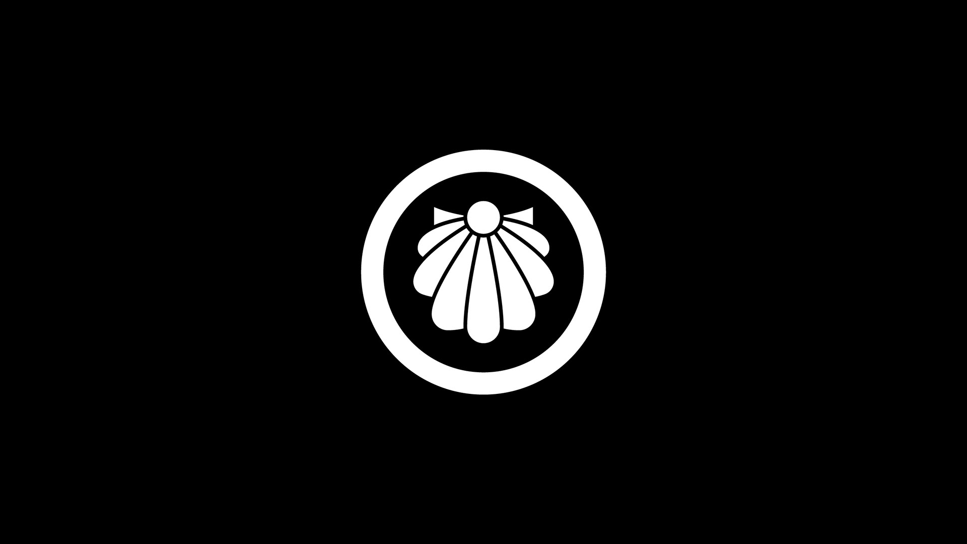
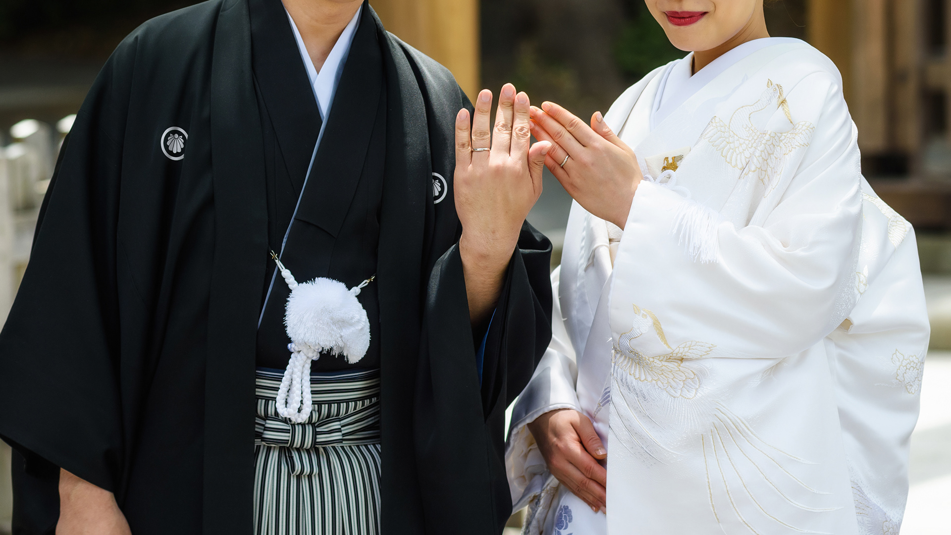
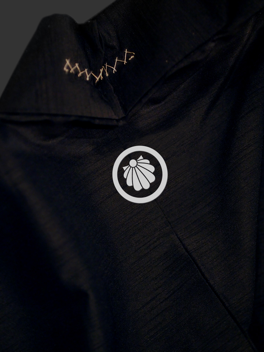
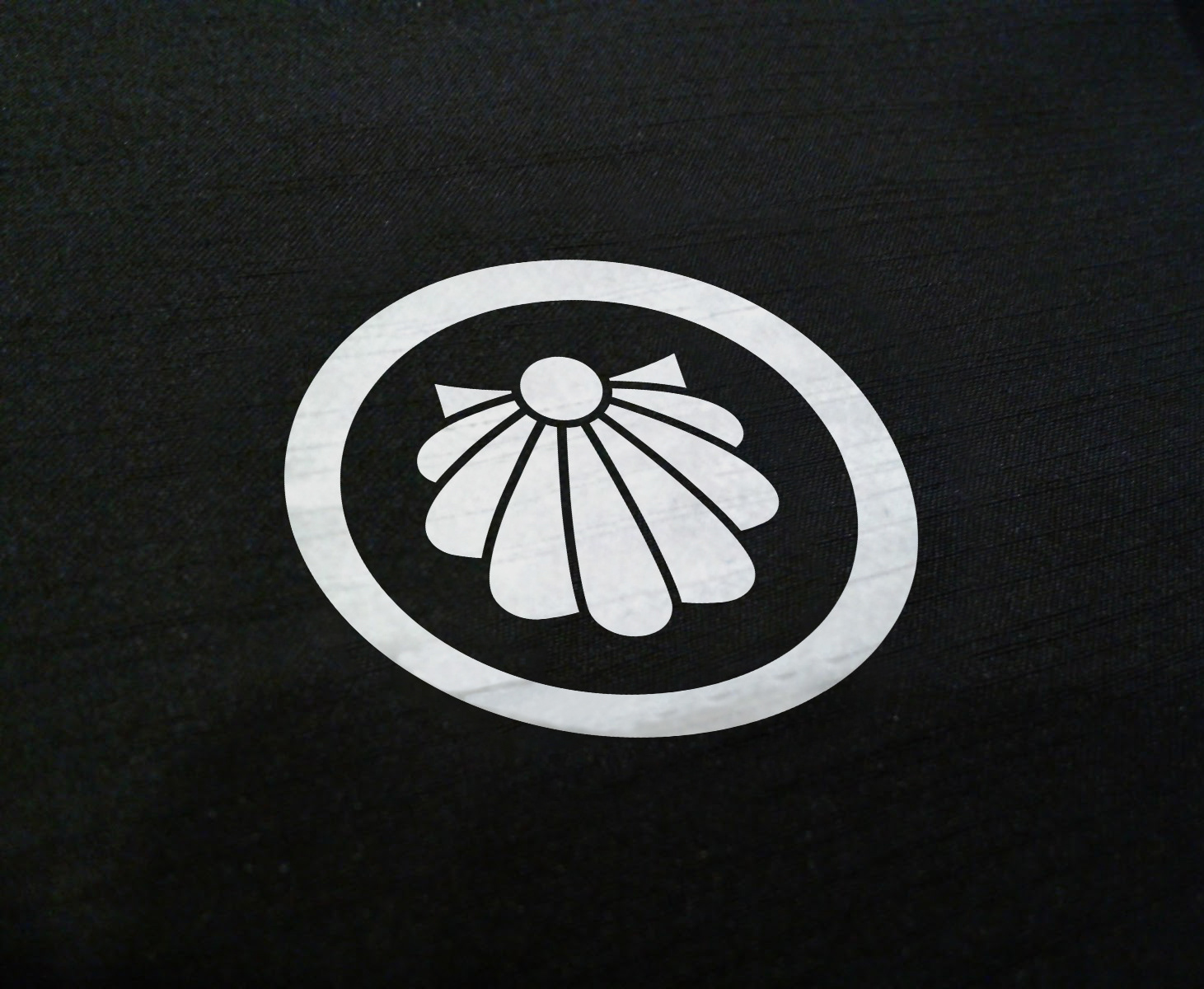
kamon
Concept: Family crest
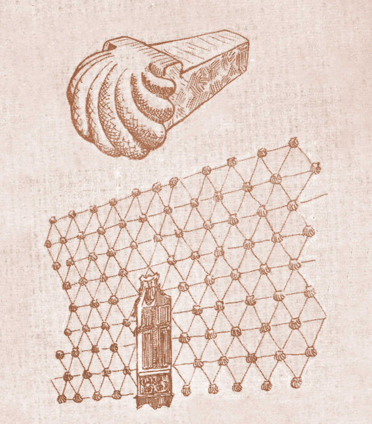
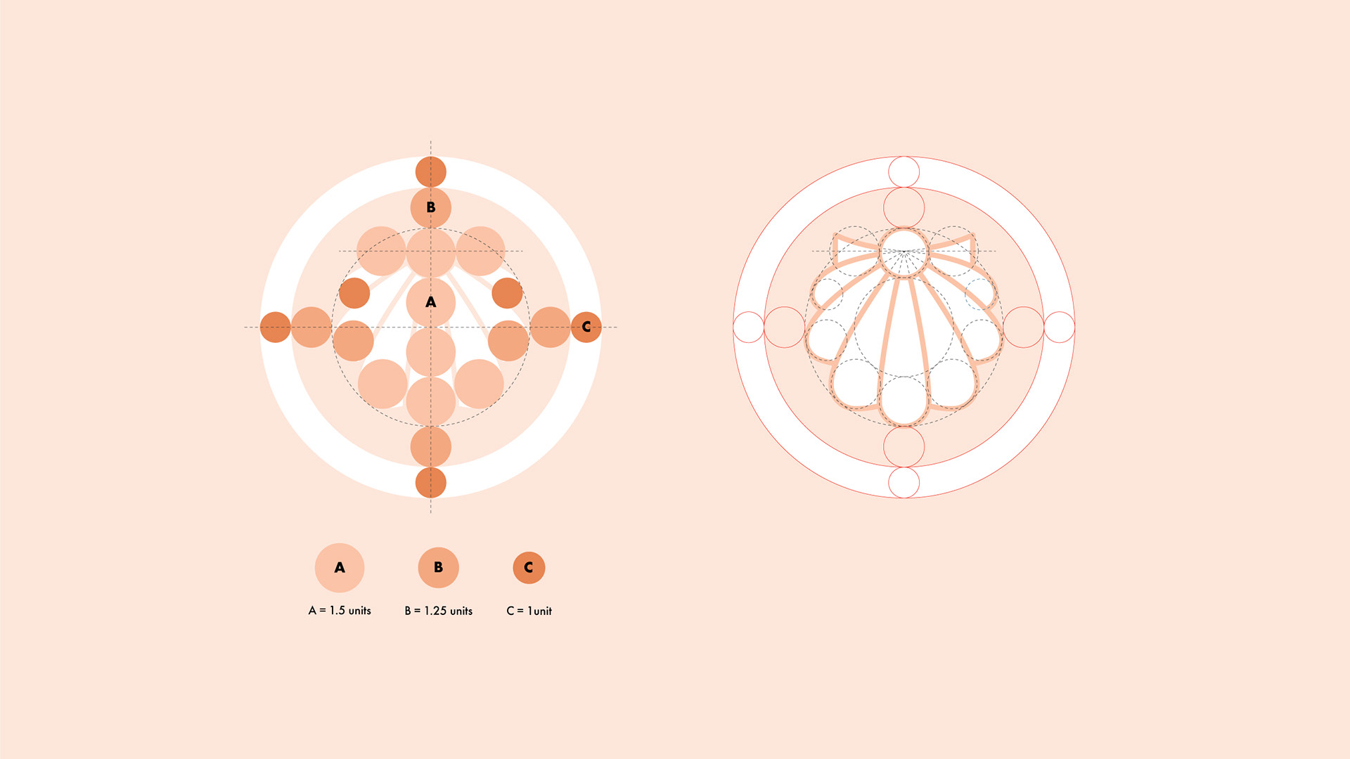
Characteristics: Geometric white figure inscribed in a circle. The shape should be predominant over the outline, so the drawing lines will show on the negative and the filled shapes on the positive. The illustration will be made by hand by a professional kamon artisan, who will manually create the family crest on the kimono fabric by using bleach and masking paper to delimit the shape.
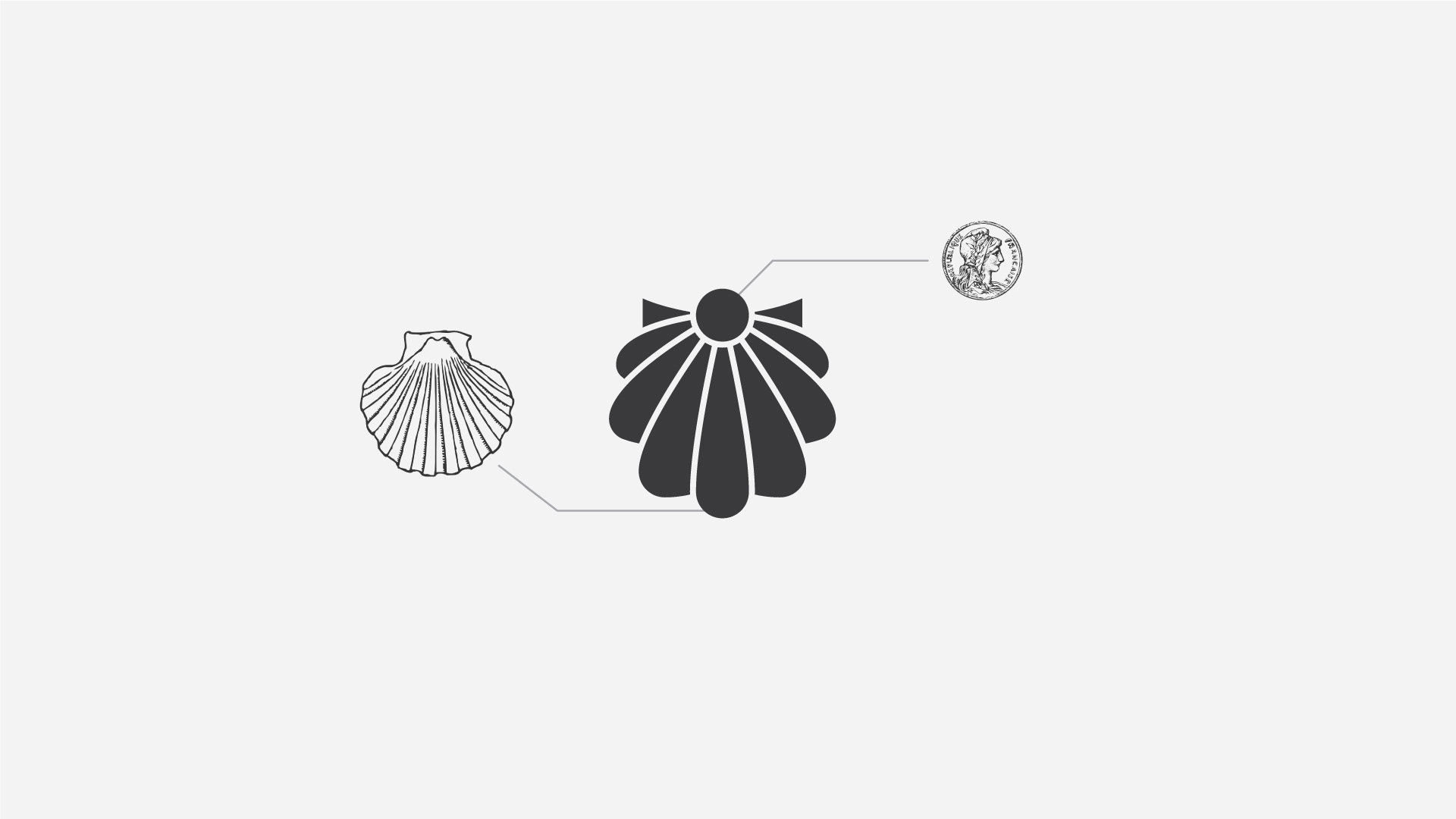
Reference: The symbol represents the place I enjoyed the most when I was a child, a library called "La casa de las Conchas," in Salamanca, Spain. The building facade is filled with stone shells, and the legend says that a golden coin is hidden inside one of them. My family crest will include these two elements together.
Execution: The coin (symbol of luck and good destiny) is on top, and the shell (symbol of life and growing) grows down from the coin to complete the shape, integrating both elements into one simple figure.
Characteristics: Geometric white figure inscribed in a circle. The shape should be predominant over the outline, so the drawing lines will show on the negative and the filled shapes on the positive. The illustration will be made by hand by a professional kamon artisan, who will manually create the family crest on the kimono fabric by using bleach and masking paper to delimit the shape.
Reference: The symbol represents the place I enjoyed the most when I was a child, a library called "La casa de las Conchas," in Salamanca, Spain. The building facade is filled with stone shells, and the legend says that a golden coin is hidden inside one of them. My family crest will include these two elements together.
Execution: The coin (symbol of luck and good destiny) is on top, and the shell (symbol of life and growing) grows down from the coin to complete the shape, integrating both elements into one simple figure.
Role: Graphic Designer
Title: Kamon family crest
Year: 2020
Tags: Logo design
Title: Kamon family crest
Year: 2020
Tags: Logo design