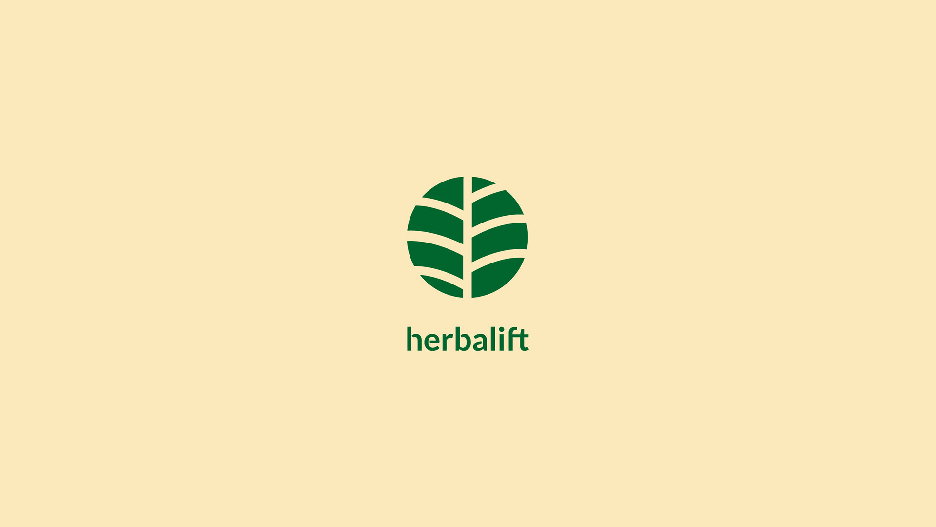
Herbalift
Herbalift is a new herbs trading company created to supply traditional Latin American herbs to Herbal shops and Medical Institutes, but also sell their products to individual clients. The goal is to succeed in the local market and expand the Herb business beyond the limits of Vancouver city. Herbalift promotes Alternative Medicine as a valid way to heal and live healthily.
challenge and opportunity
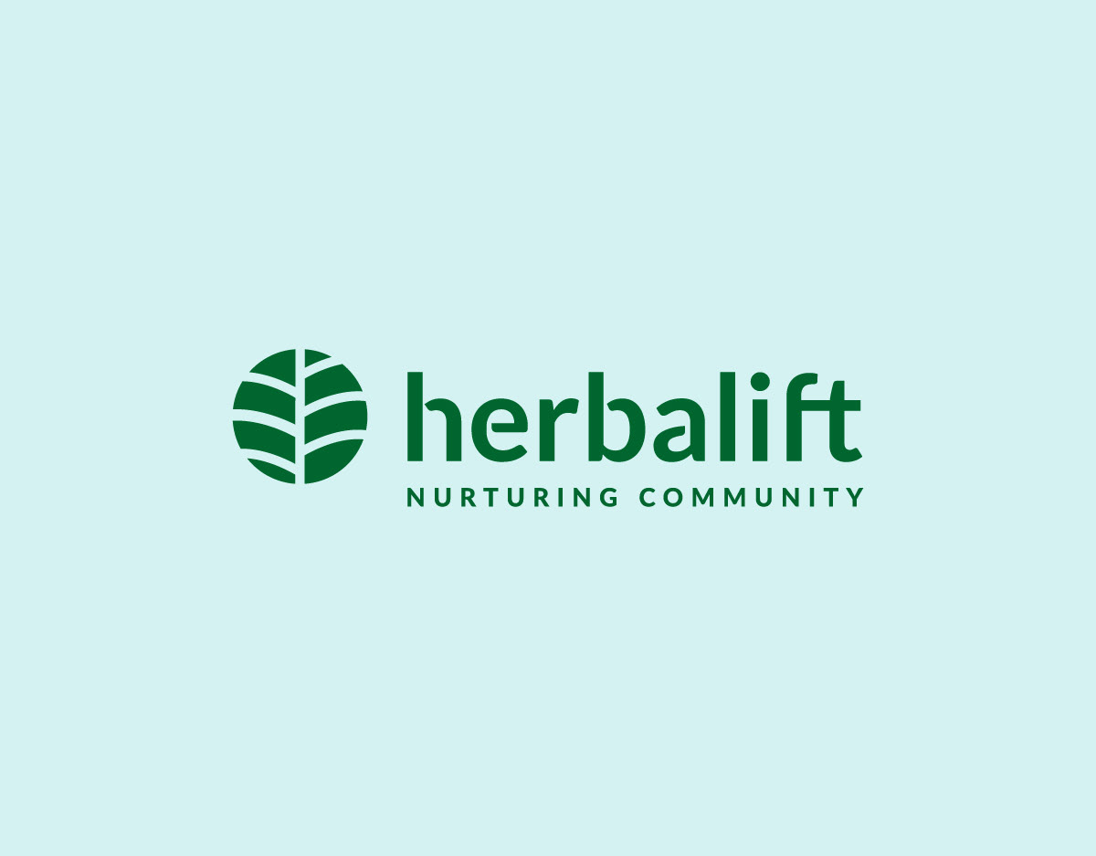
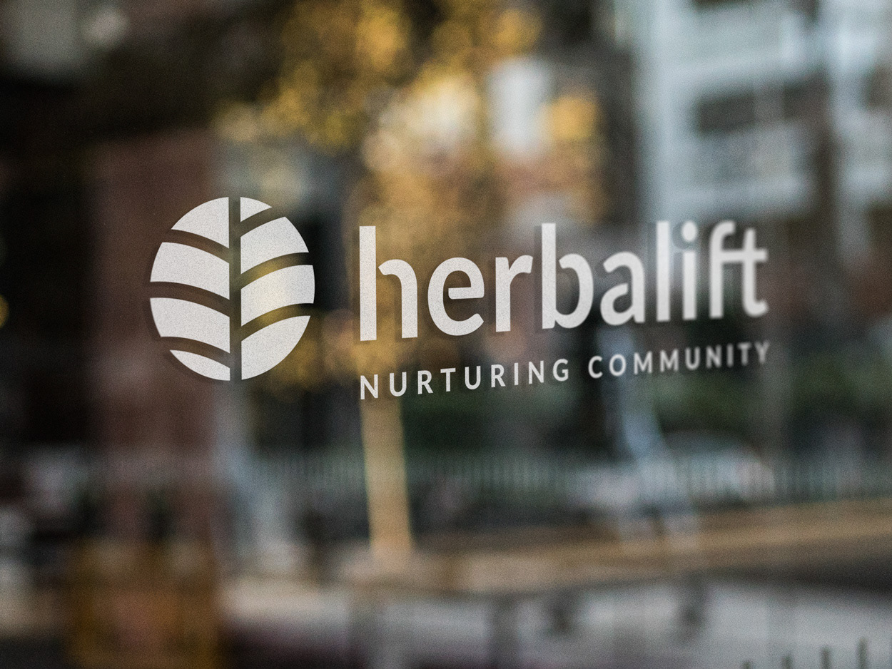
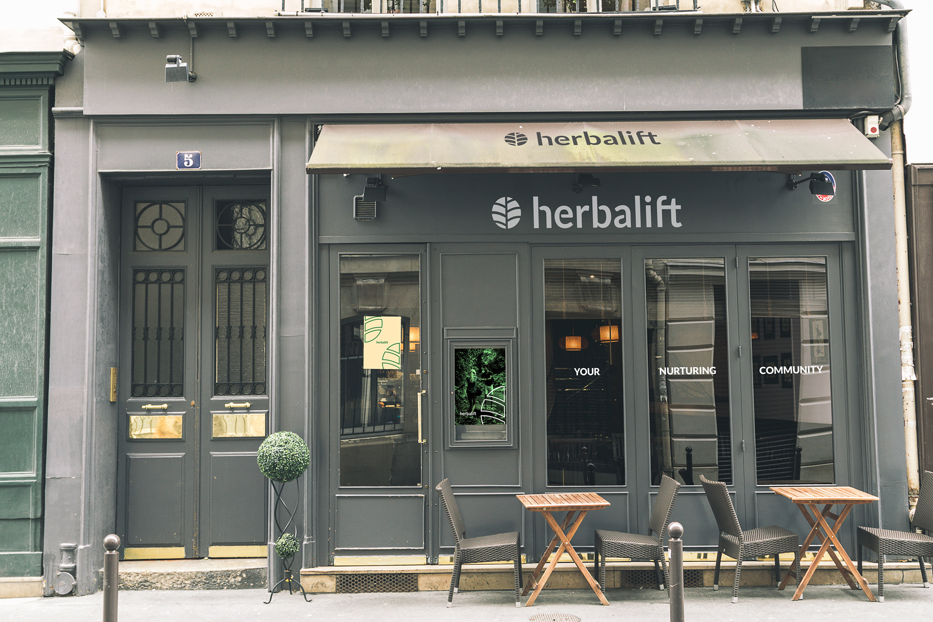
The logo and the visual identity should showcase the Herbalift mission: nurturing the local community with traditional healthy products coming from the ancient Latin American culture. Therefore, the branding needs to reconcile the idea of community with tradition and Nature.
the solution
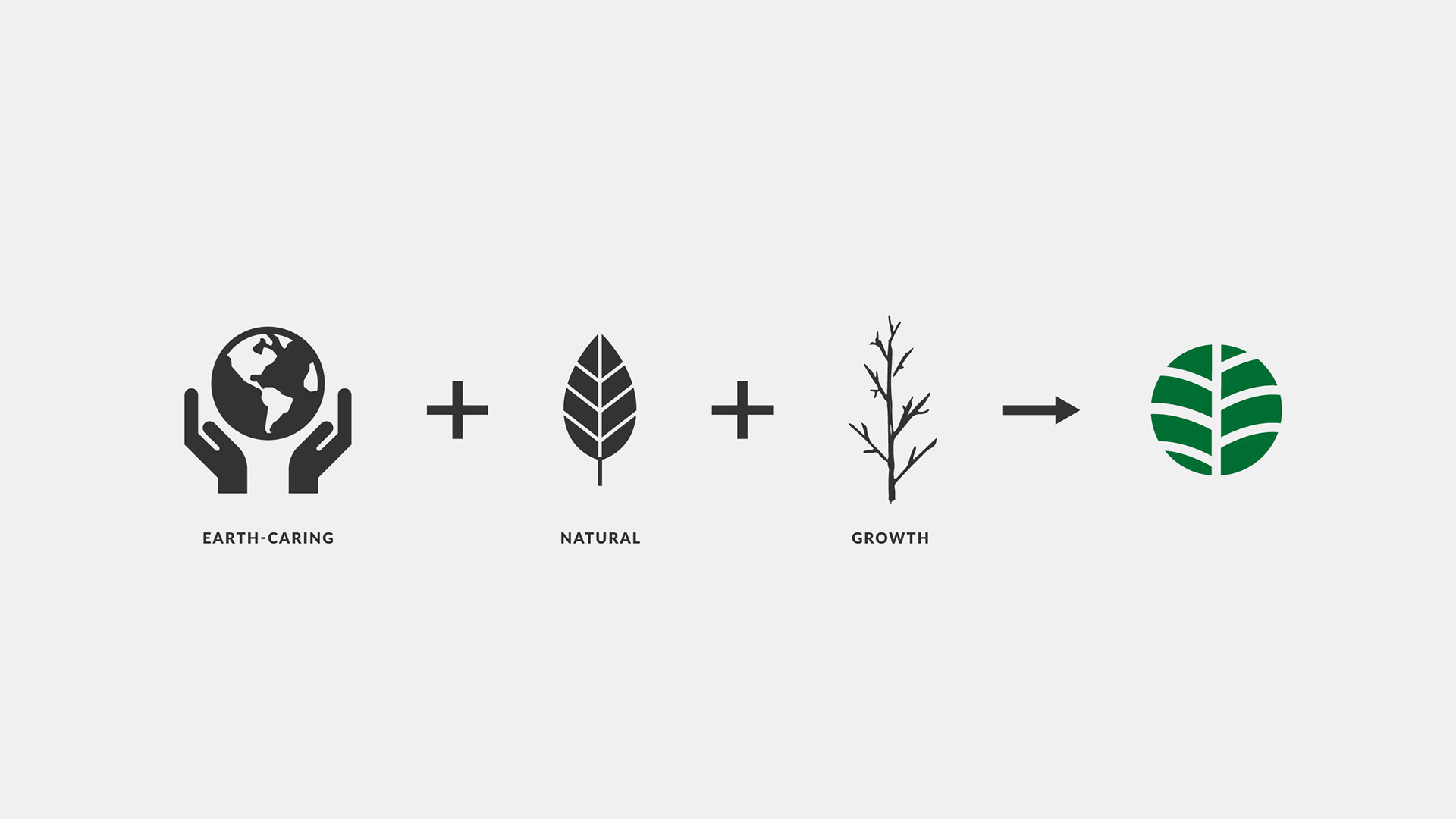
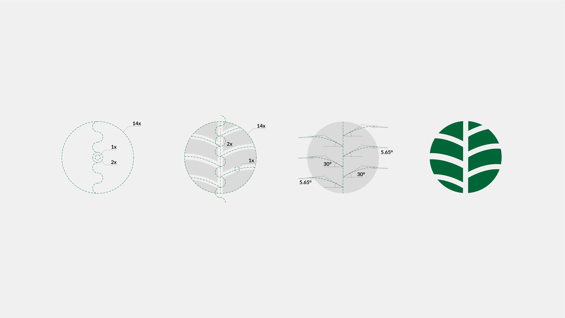
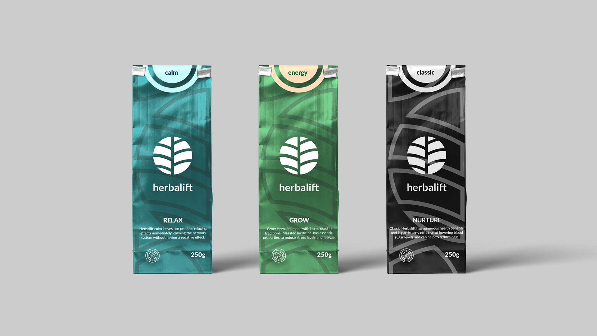
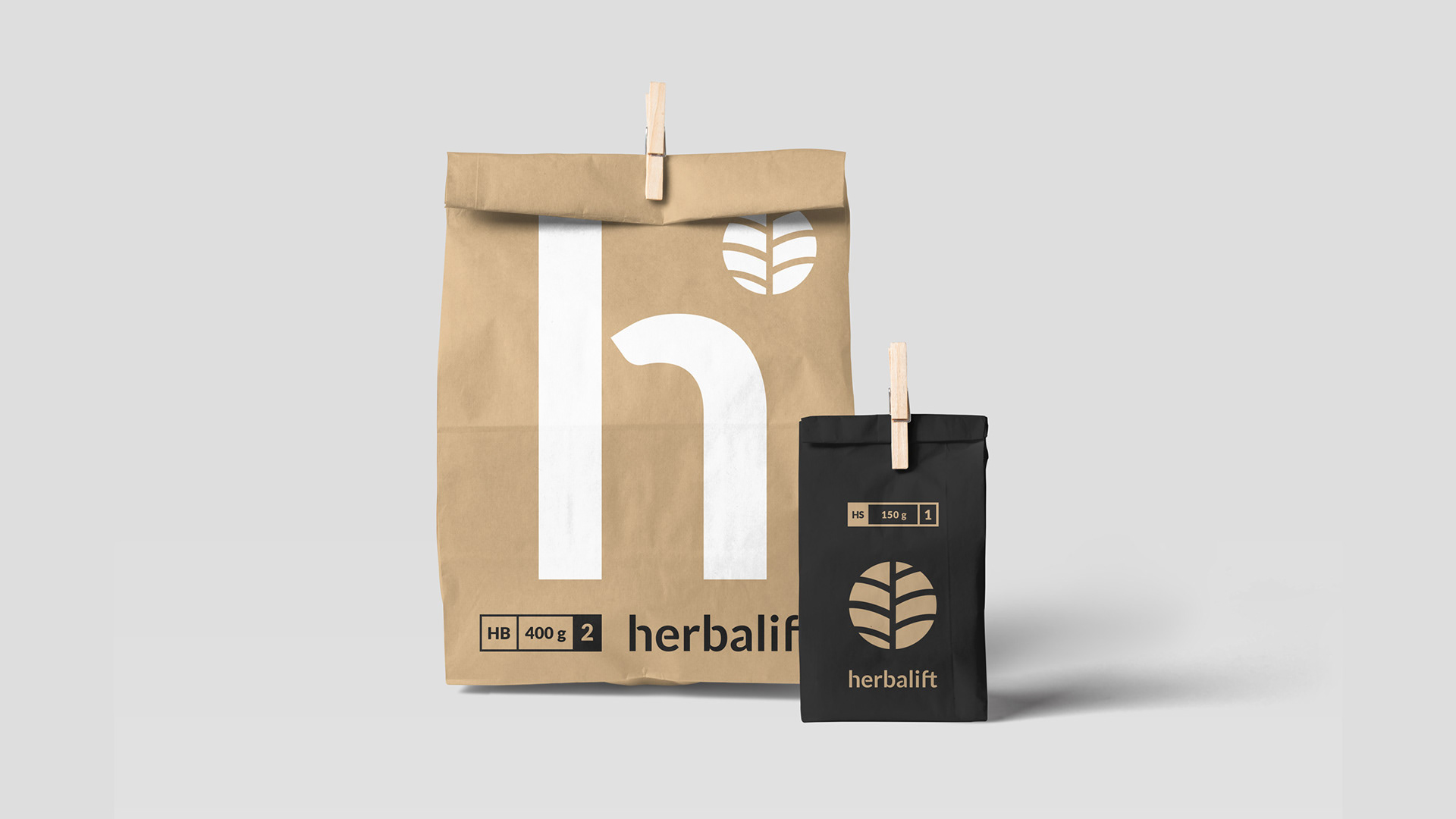
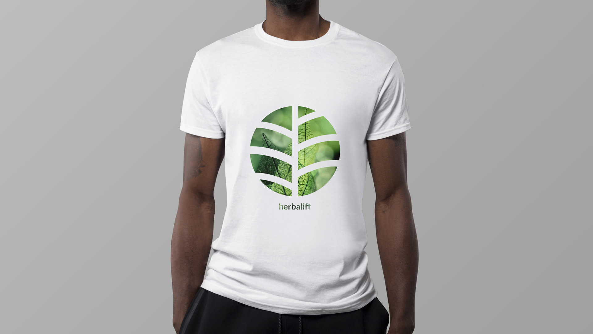
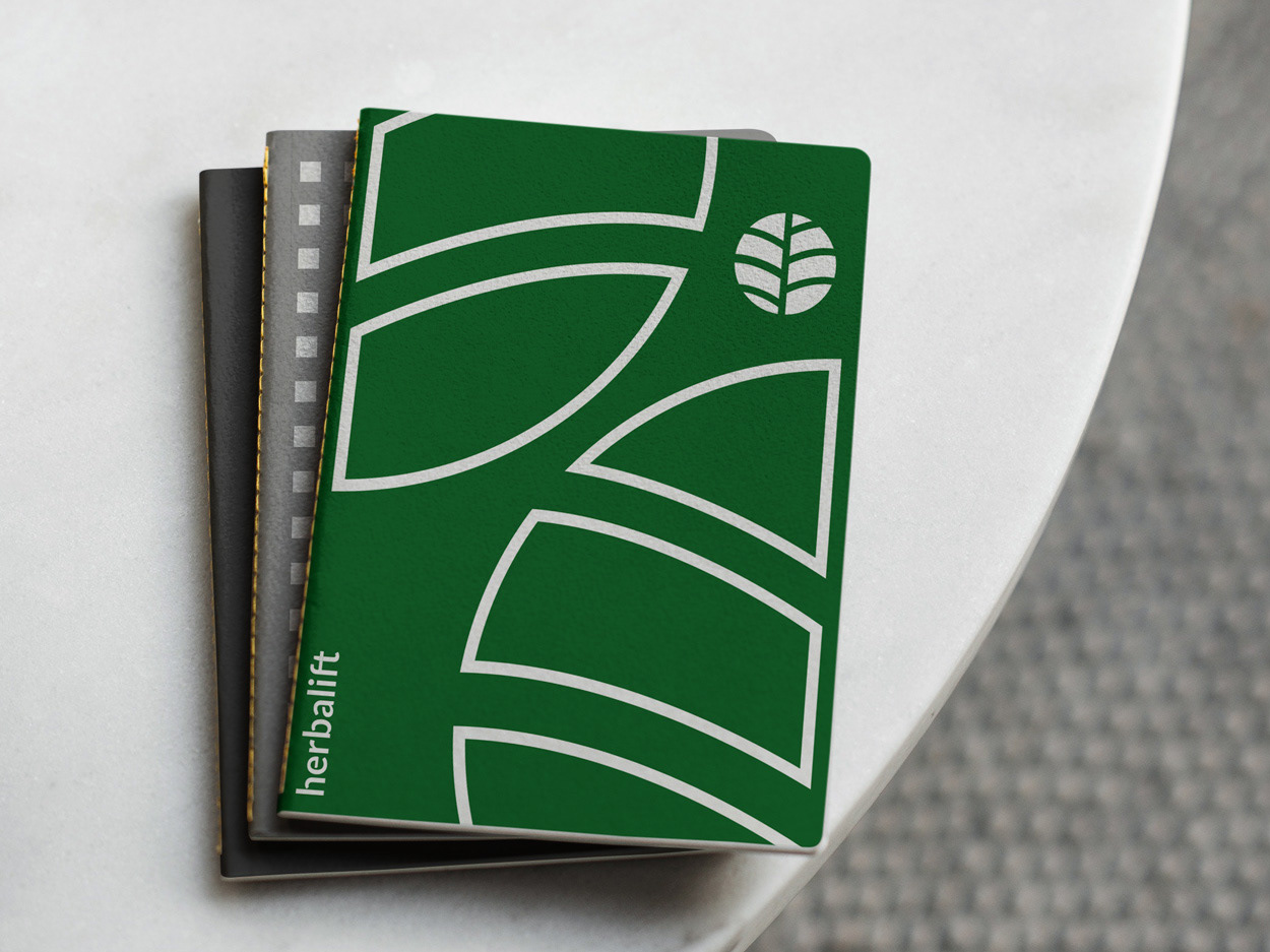
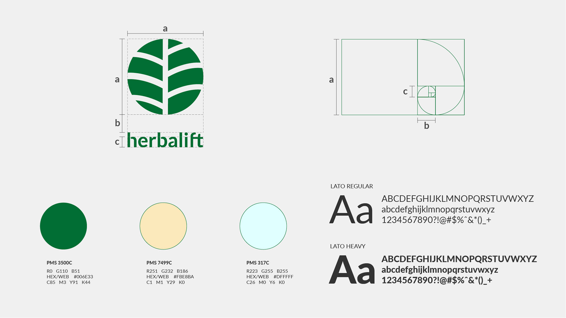
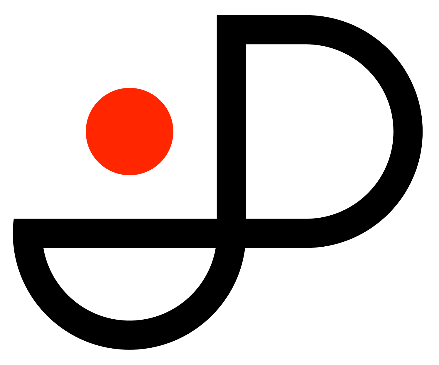
The logo is inspired by two ideas: a small plant that brings health, and a community that takes care of the world. Based on traditional Mayan symbols, the mark is modern, yet it is timeless. It is simple in colour and form, and it is read in this double value: it represents an enlarged view of the nerves of a small leaf or a tree that grows over the limits of its world. To complete the idea of the logo, the letters of the wordmark are cut in strategic places to represent the concept of organic growth without compromising legibility and clarity.
Title: Herbalift
Year: 2019
Tags: Branding, logo, typography, colour palette
Year: 2019
Tags: Branding, logo, typography, colour palette